Using R Markdown to Monitor a Faber Strategy
26 Dec, 2013 — 3 minFaber Strategy Monitor
This post was created in R using Markdown and posted directly to WordPress. It creates a table of data and a set of price charts for tracking funds used in Mebane Faber’s trend following strategy. Data is gathered from Yahoo Finance using the API in the quantmod package, then rendered into a web page using RStudio and knitr, with the help of googleVis and ggplot2. This particular implementation of the Faber strategy comes from his book The Ivy Portfolio. The program is to invest in a broad array of markets and buy individual ETFs when the price of the ETF exceeds its 10-month moving average and sell when it goes below. This particular example uses ten ETFs, two in each major category (as shown in Table 9.2 of The Ivy Portfolio). The table shows some basic information about each ETF, the current price versus the 10-month SMA, and the same price/SMA data as of the prior month end. The chart is from the great package googleVis. The default HTML viewer may not display the table correctly, so you may need to look at it using Chrome. Here is a chart using the Google Visualization API. This was updated as of 12/26/2013 04:00:00. You can click on the headings to resort the table, a nice feature of this package. The code below shows how easy it is to create a nice table from a data frame.
InvestmentTable <- gvisTable(FaberTable, options = list(width = 800, height = 300,
  page = "enable"))

print(InvestmentTable, "chart")
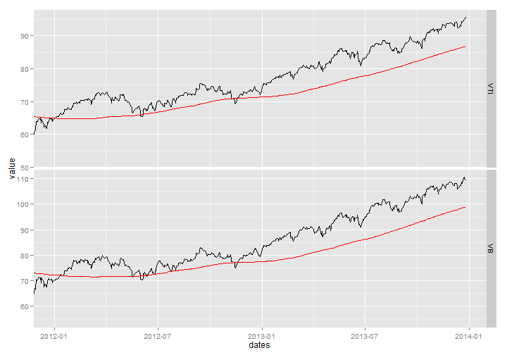
The charts below show the data from January 1, 2012 to present with the 200-day moving average in red. The charts are made with ggplot2. This is the chart for the domestic stock ETFs:
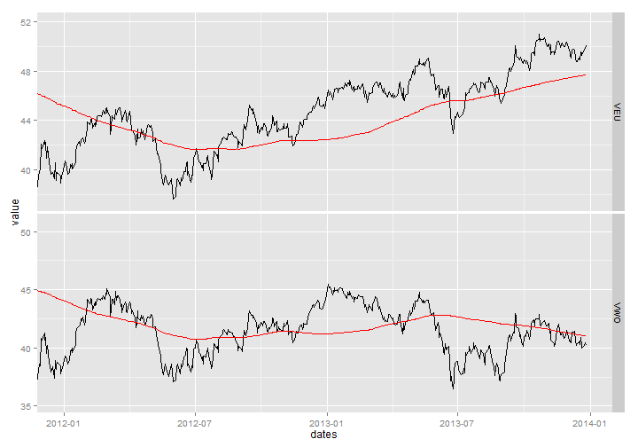
This is the chart for the foreign stock ETFs:
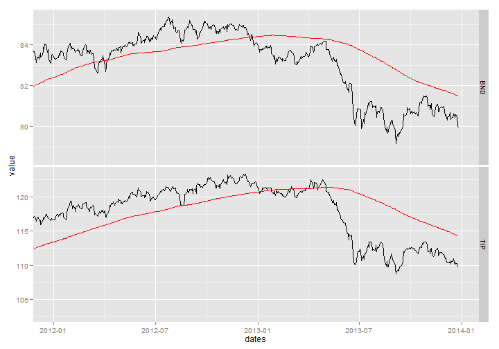
This is the chart for the bond ETFs:
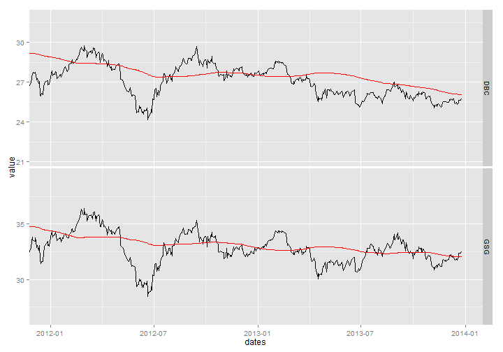
This is the chart for the commodity ETFs:
This is the chart for the real estate ETFs:
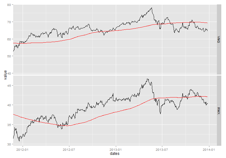
These charts show how nicely facet charts work in ggplot2. Also, by adding additional ETFs to the csv file it will seamlessly add more symbols to the charts. The table will also be expanded automatically.
While the post above was published to this blog, it is intended to be a stand-alone Markdown document for following a Faber strategy which I have been using for a while on one of my accounts. The strategy uses monthly rebalancing, and as the month passes I like to look at how the trades are working and what needs to be done. The code for this post is available at this gist.